
RSI (Relative Strength Index)
The RSI is a very complete and powerful indicator, hence its popularity with traders. Learn how to use it to perfect your analysis!
6 min read
The Relative Strength Index (RSI) is an indicator in the oscillator family. It can be used to visualize the strength of a movement, in order to determine whether the asset is overvalued or undervalued. By default, the RSI takes into account the closing prices of the last 14 periods (the last 14 hours if the chart is in 1h, or the last 14 days if you are in Daily mode, for example).
The RSI is therefore represented by the purple line varying on a scale from 0 to 100.
Here's what a chart looks like if you add the RSI :
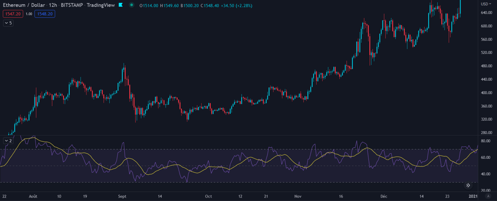
The RSI is made up of 3 distinct zones:
The overbought zone (red zone): between 70 and 100
The oversold zone (green zone): between 30 and 0
Neutral zone: between 30 and 70
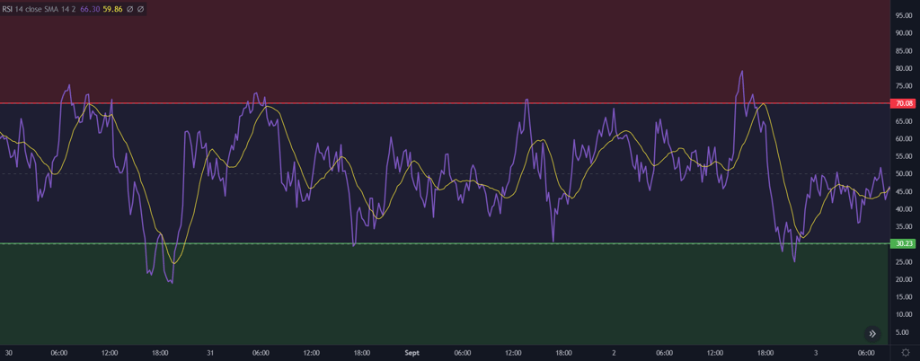
The zone names are self-explanatory.
🔴When the RSI reaches the red zone, above 70, the asset is overbought. At this point, the likelihood of an end to the uptrend and the start of a correction increases sharply. Beware: during strong uptrends, the RSI can remain in the overbought zone for a large number of periods before retracing.
🟢Conversely, when the RSI falls below 30, the asset is highly undervalued and is highly likely to reverse its downward trend and rise again. The RSI can, however, continue to fall if the market is still in the grip of a strong selling force.
🔵The last zone is the neutral zone, which remains very important as the price is more likely to consolidate and set up structures offering clear trading opportunities between the 30 and 70 levels.
You'll have noticed that an additional line can be added to the RSI: a moving average 14, which represents the average price of the asset over the last 14 periods. You can increase or decrease this figure to adjust the sensitivity of the indicator if you wish. This moving average gives you additional signals: when it crosses above, a bullish signal is given, and conversely, when it crosses below the purple line, a sell signal is given.
HOW TO USE THE RSI
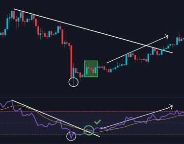
In addition to highlighting a possible overbought or oversold situation on an asset, the RSI can help anticipate movements, by knowing their direction!
For example, if the price of your asset is falling, the RSI will probably fall too, but if the asset starts to consolidate before breaking its downtrend, the RSI may break its own beforehand, giving a bullish signal ahead of the price. This is illustrated in the example below:

The opposite is also possible: your asset is in an uptrend and the RSI breaks this trend, in which case it will be more prudent to resell some of your cryptos or to raise your stop loss to avoid losing your gains.
The RSI can also structure and communicate valuable information in this way. By analyzing the RSI curve with horizontal lines, you can highlight support and resistance levels on your RSI.
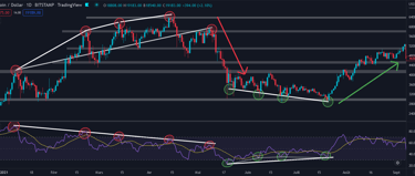
Let's take a look at the chart below, which shows 3 very interesting RSI situations.
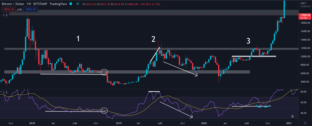
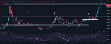
In the first situation, we see the Bitcoin curve bouncing off horizontal support while compressing. The RSI was also consolidating on a horizontal level. But it broke this level to the downside, giving a bearish signal, and indeed, the price then broke its support and fell violently. This downtrend bottomed out as soon as the RSI touched the 30 level. This was followed by an extremely bullish signal when the RSI rose above the 14 moving average!
In the second situation, we can see that the RSI formed a Double Top, a chartist's figure to be familiar with, in the shape of an M representing a bearish signal. This famous M could only be seen on the RSI, as the price made a new high. This is what we call a divergence, in this case bearish. We had a third bearish signal, as the moving average crossed below the RSI line, confirming the Double Top. All these signals made it possible to anticipate the fall that followed.
In the third situation, we note that the RSI had found horizontal support. And when the asset's price retested its former resistance levels to turn them into support, the RSI was on its support too, forming a Double Bottom (W, bullish figure). This was confirmed when the moving average moved above the RSI curve, and the price did indeed rise.
RSI DIVERGENCES
Divergences are another valuable asset offered by RSI analysis. To spot divergences, observe the RSI and watch for differences between the highs and lows of the price and the RSI. You can then interpret these differences to make a market decision.
Here's the discrepancies table:
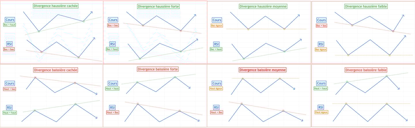
The four most important are those on the left, the strong divergences, and the hidden divergences. These divergences are highly relevant and are often correct. Bullish divergences can be spotted by looking at the high points, and bearish divergences can be spotted by looking at the low points. It may be that your chart shows you two divergences that contradict each other, so you'll need to observe your asset over a larger unit of time.
Here are a few examples:
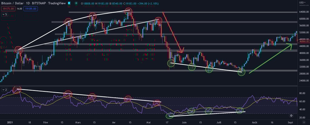
On this last chart, which is that of Bitcoin over the period January to September 2021, we can observe a strong bearish divergence and a strong bullish divergence.
The one that came first is the strong bearish divergence, characterized by higher and higher high points on the asset price, but lower and lower high points on the RSI. This is evidence of bullish movements propelled by a weaker and weaker buying force. The end result is a falling share price. If you've lived through the crypto crash of May 2021, you'll never let yourself make the mistake again, and can use this indicator to sell at the right time in the future.
The strong bullish divergence came later, as the price began to consolidate after the violent fall. The underlying trend was still clearly bearish, but volatility was decreasing. However, it was possible to notice very early on that the trend on the RSI was not bearish, as the lows were still higher than the previous ones. This is how you spot a strong bullish divergence. Those who saw it were able to start buying BTC in mid-May and continue to do so at lower prices until July, when the divergence finally took effect and the price exploded upwards, allowing the BTC accumulated over the previous two months to be resold at a substantial capital gain.
CONCLUSION
The Relative Strength Index is a very powerful indicator, hence its popularity with most traders and investors. It can be used to identify supports and resistances, the beginnings of bullish and bearish trends, buy or sell signals thanks to the 14 moving average, and to anticipate bullish or bearish movements thanks to divergences. Of course, it can be used in conjunction with chartist analysis and other indicators, but it's a very good idea to integrate it into your trading or investment strategy.
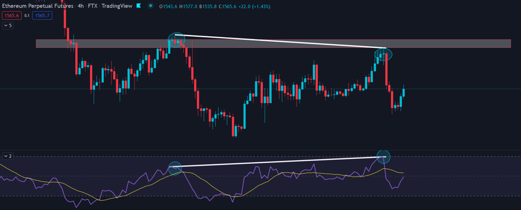
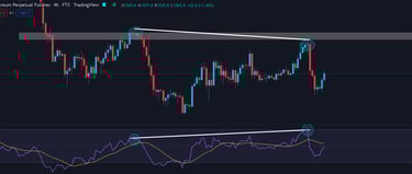
This example on the Ethereum chart shows you how to recognize the arrival of a resistance level: we can't know whether we'll break it the first time or get rejected. But by observing the RSI and comparing the high points of the price and the indicator, we can recognize a hidden bearish divergence. This occurs when an asset's price is making lower and lower highs, and the RSI is making a higher high than the last one. You could therefore lean towards the scenario of rejection on the resistance level, and that's what happened!
©2025
Contact@watchlist360.io
Watchlist360 does not provide any financial advice
⚠️Investing involves risk and may lead to partial or total loss of your capital⚠️