MACD (Moving Average Convergence Divergence)
The MACD can be used to define asset trends and determine when reversals and consolidations begin and end!
INDICATORS
6 min read


Le contenu de mon poste
The MACD can be used to define asset trends, to determine when reversals and consolidations begin and end!
MACD stands for "Moving Average Convergence Divergence". It's an oscillator based on the divergence and convergence of moving averages.
It can be used to detect bullish and bearish trends in relation to the chosen time unit. (It's possible to be in an uptrend on a daily basis, but in a downtrend on a 4-hour basis, for example). Thanks to this indicator, you can also detect the end of a trend so you can decide whether to buy or sell.
However, it is not advisable to use this indicator during range periods, as, being based on moving averages, the signals given will lag and not be relevant in these market configurations. You can, however, use it in smaller time units to try and trade this range. A daily range is bound to offer trading opportunities in smaller time units.
As explained, this indicator can lag the price and show you that a fall is imminent, even though it has already begun (which does not falsify the indications given by the MACD, as the fall can continue or even accelerate).
Here's what a MACD chart of an asset looks like:
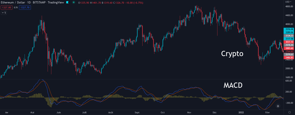
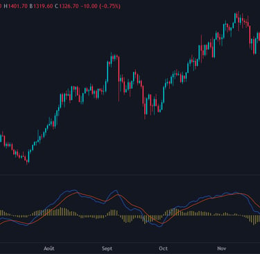
This indicator is composed of 2 lines and a histogram:
-The blue line (MACD Line) is the one that reacts most to the price, representing an exponential moving average. Its default entry parameter is 12, which means it takes into account the closing price of the last 12 candles. It's also known as the "Quick Length".
-The orange line (Signal Line) is less volatile, and is an exponential moving average 26 by default. You can change the indicator's parameters if you think you've found a more relevant combination. This signal line is also called "Slow Length".
-The histogram represents the difference between the MACD line and the Signal Line, meaning that when the MACD line is above the Signal Line, the histogram will be positive, and conversely, when the MACD line is below the Signal Line, the histogram will be negative.
It's by studying the movement of these 2 lines that we can interpret their indications.
In very general and simplified terms, bullish signals are given when the blue line crosses above the orange line. And bearish signals are given when the blue line crosses below the orange line. The first thing to watch out for are the crossings of these 2 lines.
Here is an example of how this indicator works, and the bullish and bearish trends that result from MACD crossings:
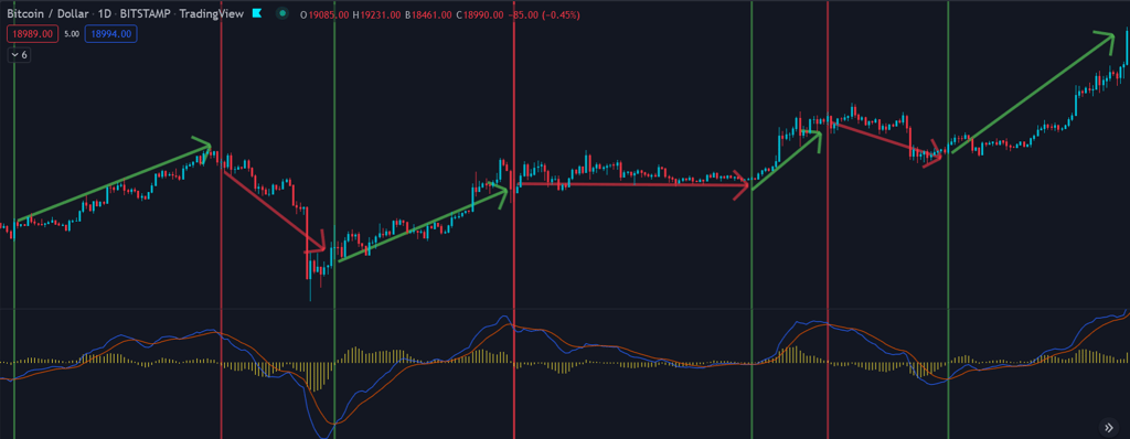
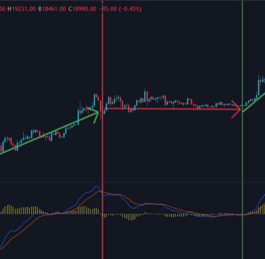
We can see that many bullish or bearish crossovers are relevant and indicate the direction the price will take over the following periods. But a few irrelevant crossovers are also observable.
This is how most investors/traders use the MACD, but this indicator is even more complex. Although moving average crossovers are relevant, they can arrive with a delay, and give false signals. For example, we may be in an uptrend, have a bearish crossover that causes the uptrend to slow for 3 periods, and then the lines recross upwards. If we sell at the first bearish crossover, we may close our position too early.
So there's another way to use this indicator. Using the MACD when the price is in a clear trend will be very effective.
You can use the position of the lines to find out the underlying trend of your asset in relation to the chosen U.T.:
-If the 2 lines are above the 0 level (green zone in the photo below), the underlying trend is bullish.
-If the 2 lines are below level 0 (red zone), the underlying trend is bearish.

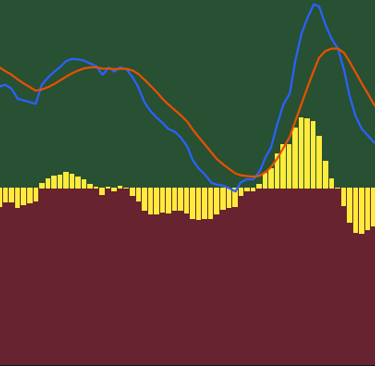
Once you've identified the underlying trend thanks to the position of the 2 lines above or below the 0 level, some very important new information will be identifiable.
The full power of the MACD is that it can tell you whether these trends are strong and continuing, or whether they're on pause and the price is consolidating, or whether they're running out of steam and are about to reverse.
When the underlying trend is bullish, and the 2 lines are therefore above the 0 level, and the MACD line is above the signal line, then your uptrend is strong and unlikely to reverse quickly. But when the MACD line falls below the signal line, the uptrend will slow down and the price is likely to consolidate.
The uptrend will be reversed, and will turn bearish if the 2 lines pass below the 0 level, and the principle is the same: if the MACD line is below the signal line, then the downtrend is strong, and if they cross again the price will have a good chance of consolidating during this downtrend.
Let's look at a chart for a more concrete example:
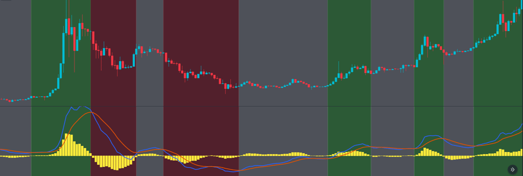
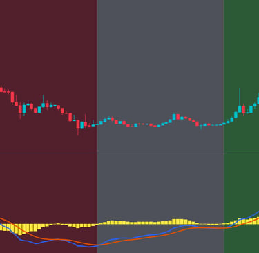
In this example, we can observe each of the recognizable cases. To identify them, we'll study the chart chronologically.
In the first period, highlighted in white, we can see that the underlying trend on the MACD is bullish, as the 2 lines are above the 0 level, but the asset price is not rising significantly, as the MACD line (the blue one) is below the signal line (the orange one), so the price is consolidating.
It's only when the MACD line crosses above the signal line that the share price rises sharply, a period highlighted in green.
This strong uptrend will be maintained until a bearish crossover is confirmed on the indicator, when we pass over the first zone highlighted in red. The 2 lines are still above 0, but a downtrend has begun on the asset price. It will be strong, and will ease off at the next bullish crossover.
However, the subsequent bullish crossover (second white zone) will fail to kick-start a genuine uptrend, and the indicator will cross back down again after a few periods.
We are now entering the second red zone, with a downtrend underway that will accelerate when the 2 lines fall below the 0 level. The underlying trend on the indicator turns bearish, and the share price makes a lower low point than the previous one, confirming the underlying bearish trend.
This downtrend will remain fairly strong until the MACD line again passes above the signal line (third white zone), but our 2 lines are still below the 0 level, so we're still in a downtrend, but the price will be able to consolidate throughout this period. The price is thus becoming much less volatile.
When the 2 lines manage to break through the 0 level, with the MACD line above, the price can start a new uptrend. In fact, in the second green zone, we can see an increase in the asset price.
This increase will continue until the next white zone, which highlights a bearish crossover when the 2 lines are above the 0 level. This indicates an underlying uptrend, but one that is conducive to price consolidation. This is exactly what we're seeing.
The uptrend will resume at the next bullish cross (third green zone), then reconsolidate at the next bearish cross as long as the 2 lines remain above the 0 level. And finally, the last green zone proves the power of this indicator: after the last bullish cross, the share price will soar again!
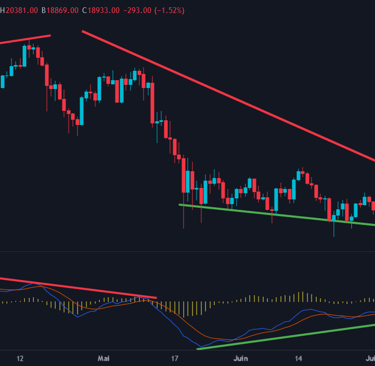
There's one last way to use this indicator, and that's to study the divergences between the price and the MACD. Like the RSI indicator (a full article on it is available on our site), it can indicate future movements thanks to the trend differences between the price and the indicator.
There are 2 types of divergence: bearish and bullish:
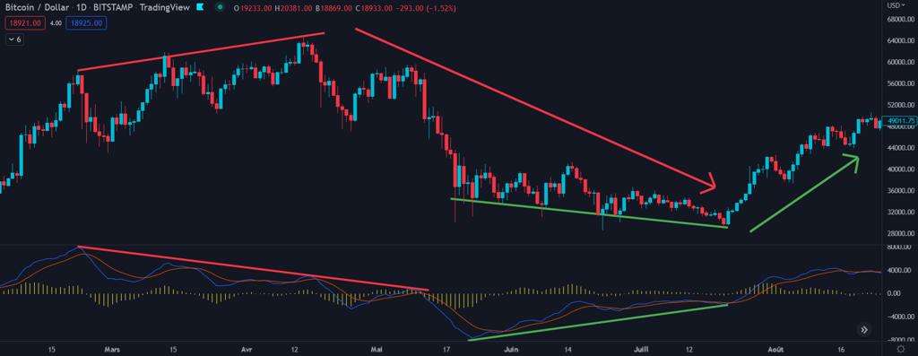
-Bearish divergences occur when price peaks are higher and higher, but MACD indicator peaks are lower and lower.
-Bullish divergences occur when price bounces are lower and lower, but MACD indicator bounces are higher and higher.
The example below illustrates the 2 types of divergence: first bearish divergence, then bullish divergence:
Conclusion
This indicator is very popular with investors and traders alike, and no wonder. Its accuracy and the different ways in which it can be used make the MACD a very powerful indicator if used properly. However, you'll need to pair it with technical analysis and other indicators to confirm your analyses.
Remember that line crossings indicate buy or sell signals, but above all the end of a bullish or bearish trend, depending on whether the lines are above or below the 0 level. Trend reversals are confirmed when the 2 lines cross the 0 level. You can also look for divergences using the MACD and compare them with the RSI.
©2025
Contact@watchlist360.io
Watchlist360 does not provide any financial advice
⚠️Investing involves risk and may lead to partial or total loss of your capital⚠️


